Horn: The Dragon Alphabet Font That Commands Attention
It’s 3:47 p.m. on launch day—and I’m squinting at a YouTube thumbnail preview on my phone. The background is rich, moody, and textured: deep indigo with subtle gold foil swirls. But the headline? It’s getting swallowed. A clean sans serif feels too quiet. A playful script feels off-brand. Then I remember Horn.
I drop in “LEGENDARY LAUNCH” in Horn—just the regular weight, all caps, centered over the image. Instantly, the composition breathes. Not because it’s louder, but because it’s authoritative. Ornate without being fussy. Mythic without feeling costumed. Horn isn’t just decorative—it’s declarative. And that’s exactly what this campaign needed.
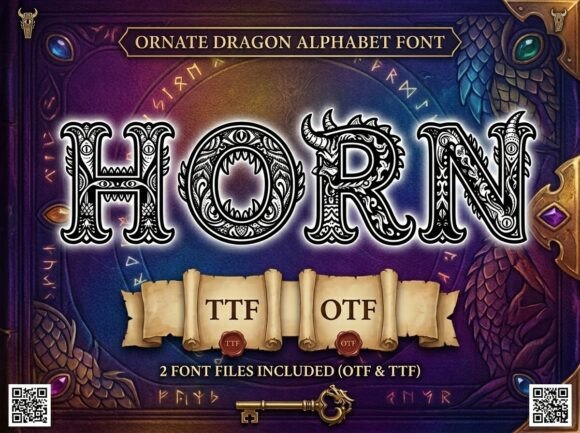
Horn is a premium display typeface built for moments where tone matters as much as text. Think of it as a dragon alphabet font: each glyph carries weight, history, and presence—curved serifs like clawed edges, terminals that flare like ember-lit wings, letterforms that balance ancient elegance with bold readability. It’s not fantasy cosplay typography; it’s high-fantasy *clarity*. You feel the magic, but you never lose the message.
We used Horn across six touchpoints in a recent online shop campaign: Instagram Reels covers, Pinterest story pins, email banner headers, landing page H1s, digital ad headlines (120×600 and 300×250), and even the “Coming Soon” label on product preview cards. In every case, it anchored the visual hierarchy—not by shouting, but by standing still while everything else moved around it.
Here’s what works—and what doesn’t:
- Best for short, high-impact text: Headlines, campaign tags (“SUMMER SAGA”, “FINAL BATTLE SALE”), logo-style wordmarks, quote callouts, and webinar titles (“Unleash Your Craft”). Horn shines when it has breathing room—never cram it into tight captions or paragraph blocks.
- Avoid long paragraphs or body copy: It’s a decorative font, not a text font. Even at 18pt, readability drops fast in multi-line settings—especially on mobile feeds where users scroll in under two seconds.
- Thumbnails & small previews? Yes—with constraints: Use Horn at minimum 48pt for YouTube thumbnails, 36pt for Instagram Story text overlays, and always test against your background contrast. On dark backgrounds, its fine details pop. On light ones, increase tracking slightly to keep glyphs distinct.
- Pair it intentionally: We paired Horn with Inter (a neutral, highly legible sans serif) for all supporting text—captions, bullet points, CTAs. The contrast is strategic: Horn sets the mood; Inter delivers the info. For editorial-style promo graphics, we swapped in a crisp serif like EB Garamond for subheads—elegant but grounded.
One real moment that stuck: designing a set of Pinterest pins for a fantasy-themed course bundle. Early versions used a generic “medieval” font—too jagged, too busy. Engagement was flat. When we switched to Horn, the pins didn’t just look better—they felt *inviting*. Not intimidating. Not kitschy. Just unmistakably *of that world*. Users paused longer. Click-throughs rose—not because of algorithm luck, but because the font made intent legible before the eye even registered the words.
Horn also includes thoughtful design assets beyond the base regular weight: stylistic alternates (like a dramatic “R” with extended tail), discretionary ligatures for “TH”, “OR”, and “HN”, and OpenType features that let you finesse spacing and rhythm without manual kerning. We used the alternate “H” in our logo lockup and the “OR” ligature in “FORGE YOUR PATH”—tiny touches, but they added cohesion across all campaign materials.
Licensing is straightforward—commercial use included—but always double-check before exporting for client work or merch. We confirmed Horn supports Latin Extended-A (covers most European languages), includes basic punctuation and numerals, and ships in OTF and WOFF2 for web use. No surprises. No last-minute font substitution panic.
Does Horn work for every brand? No. If your voice is minimalist, tech-forward, or clinical, it’ll feel dissonant. But if your message lives in wonder, legacy, craft, or transformation—if your audience leans into storytelling, symbolism, or sensory immersion—then Horn isn’t just a font choice. It’s a tone-setting tool.
We used it for a limited-time offer banner on a creator’s online shop: “DRAGONSCALE DISCOUNT — 48 HOURS”. Horn handled the all-caps headline cleanly, while the supporting line (“Use code SCALE24 at checkout”) stayed in Inter. On desktop, the pairing felt cinematic. On mobile? Still scannable—thanks to generous letter-spacing and careful sizing.
And yes—we tested readability on three devices: iPhone SE (small screen), iPad Air (mid-tier), and Pixel 7 (Android default rendering). Horn held up best with a slight stroke contrast boost (+5% in Figma) and consistent background opacity (85% black overlay on image-based banners). No pixelation. No fuzzy edges. Just confident, controlled presence.
That afternoon, before the launch went live, I opened the final Figma file and scrolled through the full campaign set—Reels cover, email header, Pinterest pin, ad carousel frame, landing page hero, and Shopify banner. Same font. Same voice. Different formats. Zero visual whiplash. That’s the power of a well-chosen display font: it doesn’t just dress up your message—it makes your message instantly recognizable, even out of context.
Horn won’t fix weak copy. It won’t replace smart strategy. But when your campaign hinges on making people *feel* something before they finish reading—when your thumbnail has to stop a scroll, your email banner has to cut through inbox noise, or your landing page has to signal “this is different”—that’s when Horn earns its place in your font library.
It’s not decoration for decoration’s sake. It’s typography with intention. A dragon alphabet font that doesn’t roar—it *resonates*.